

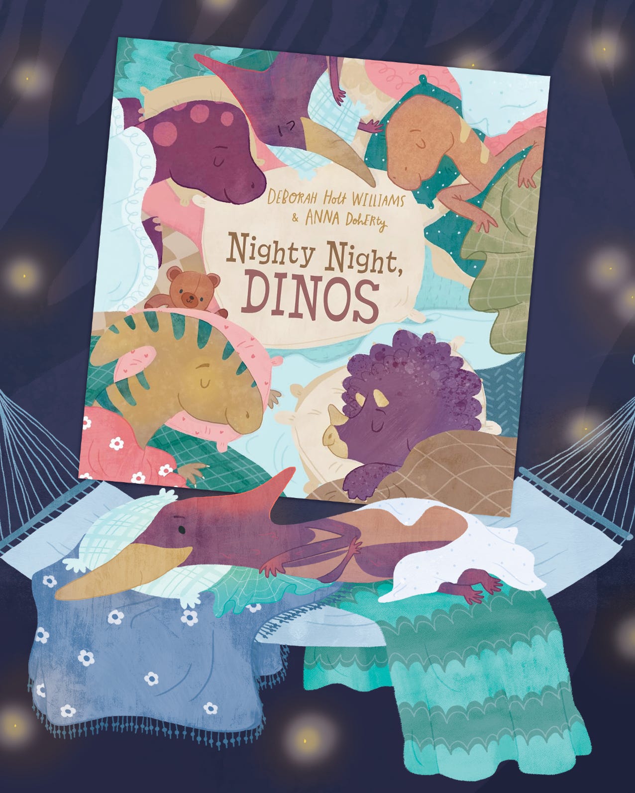
Nighty Night, Dinos
All about my new book, publishing in June!
Hello friends,
How are you? Hope you’re well and happy and having a cosy day so far.
This month, my newest book is coming out! Nighty Night, Dinos publishes in the US on June 16th (and in the UK on 23rd July - sorry UK!).
I thought I’d talk a little about illustrating it this month, and give you a little sneak peek into the process before its release day!
I worked on Nighty Night, Dinos from May 2024 through to February 2025. It’s written by Deborah Holt Williams (who I hadn’t worked with before, which is always fun to explore a new author’s voice), and published with Familius (who I had - they also published my books A Steminist Force and What Will I Be From A-Z).
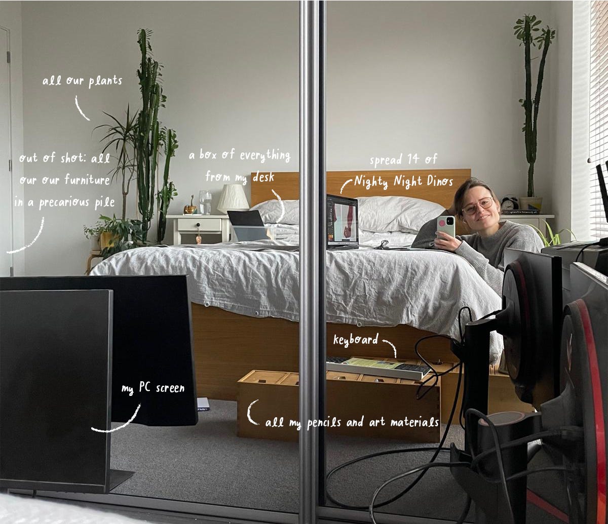
The project spanned a busy time for me - I was also illustrating Big Ideas from Science; I was working two days a week as an Art Technician; and in August 2024 we moved flat - which was more time consuming than normal as a lot of things seemed to go wrong. We had an endless stream of repair people/painters/plasterers/engineers visiting. At one point we had a leak and almost the whole ceiling of the flat had to be replaced, and we had to move everything we owned into our bedroom or hide it under sheets in a giant pile in the middle of the living room.
So this book at a bit of a chaotic entry into the word - ironic considering the theme of sleepiness.
Nighty Night, Dinos is a rhyming book written for bedtime routines, gently visiting a selection of dinosaurs as they get ready for sleep. It’s a little different from the books I had illustrated before (primarily non-fiction or fun animal tales) because it’s designed to be sleepy and bed-focused, rather than bouncy and exciting.
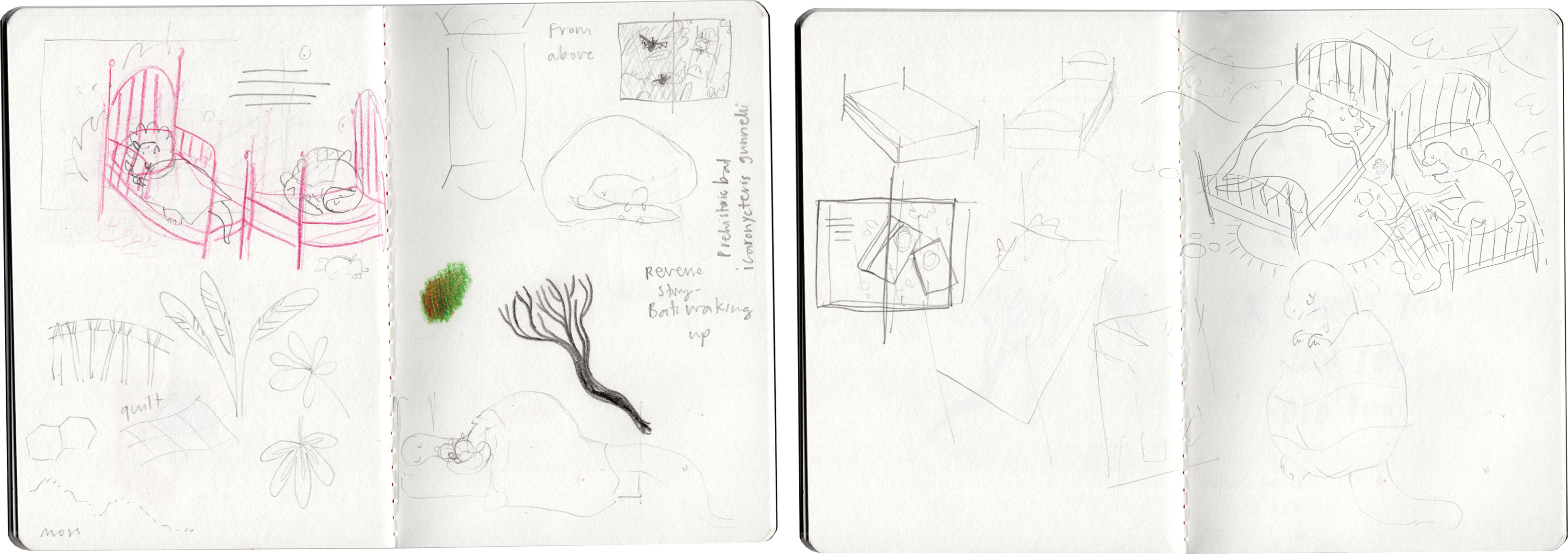
Working with Familius, they like to see a character design before the storyboard (the rough layout of all the pages). As this book had so many dinosaur characters, it seemed a bit much to design them all, so I thought I’d pick two as examples.
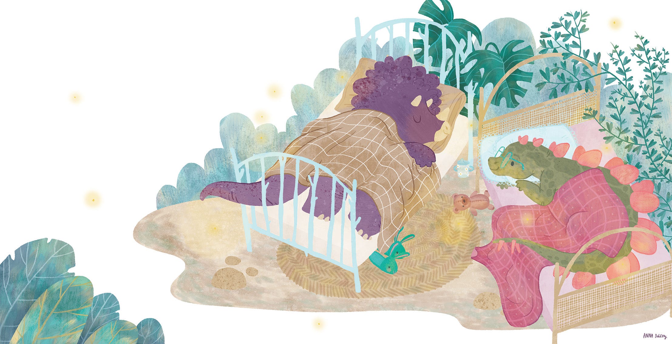
I chose Stegosaurus and Triceratops, as they appeared on a spread together, and I thought it might make sense to figure out how they would work together in terms of design and colour palette. I had already had a long think about the route I wanted the book to take, and I had settled on the dinos having ‘human’ beds and bedtime things (duvets/slippers/teddies etc) rather than ‘dinosaur’ beds (eg nests/burrows/whatever a dinosaur slept in).
The text for this spread is quite simple and therefore open to interpretation as an illustrator:
Sleepy Stegosaurus plops
Next to tired Triceratops.
There was a lot of creative licence available for me here. After some exploring, I decided to go for each dino snoozing in their own twin bed in a jungly setting.
After finding a layout and a rough idea of the characters, it was time to draw the colour character sketches. The first thing I drew wasn’t actually the characters themselves, but these leaves.
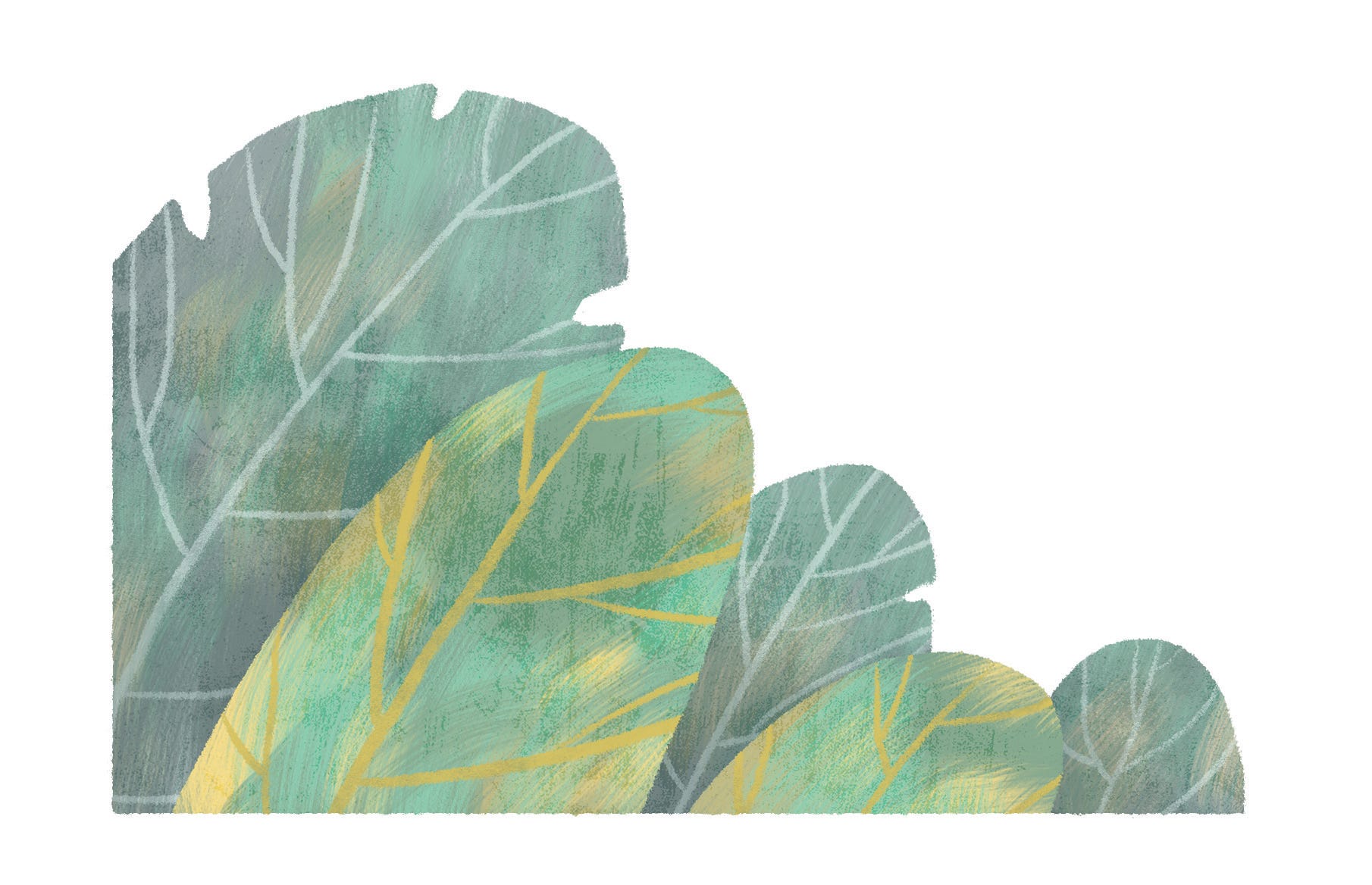
They were a little bit of an experiment for me. I always work in layers, like a digital collage, but these leaves included a new ‘painty’ technique I had been exploring around that time, incorporating a layer of coloured gouache texture to add more depth and interest. Which I liked.
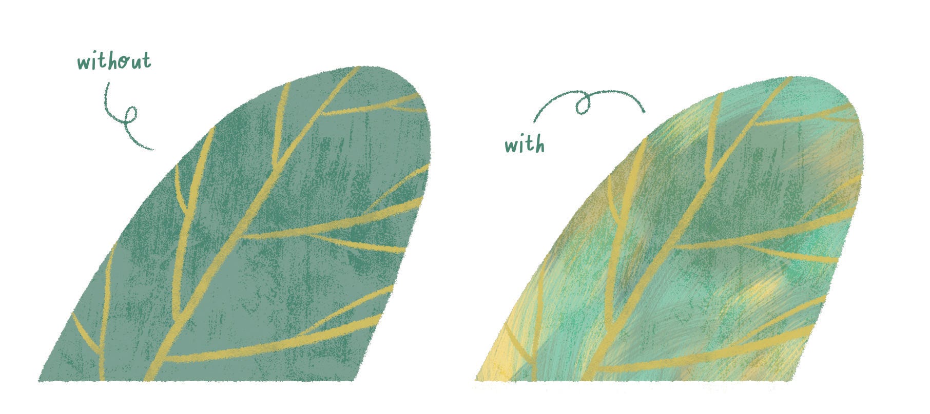
Because I liked the effect of this painty technique, I decided to lean more into the collaged texture feel for the dinosaurs too. I wanted to make them equally textured but different from the background plants, to show their lizard-y skin.
I tried a few things, and what ended up working for me was overlaying a selection of bumpy paint textures I made and scanned into Photoshop, and/or close-up photos of stones that I snapped on my camera.
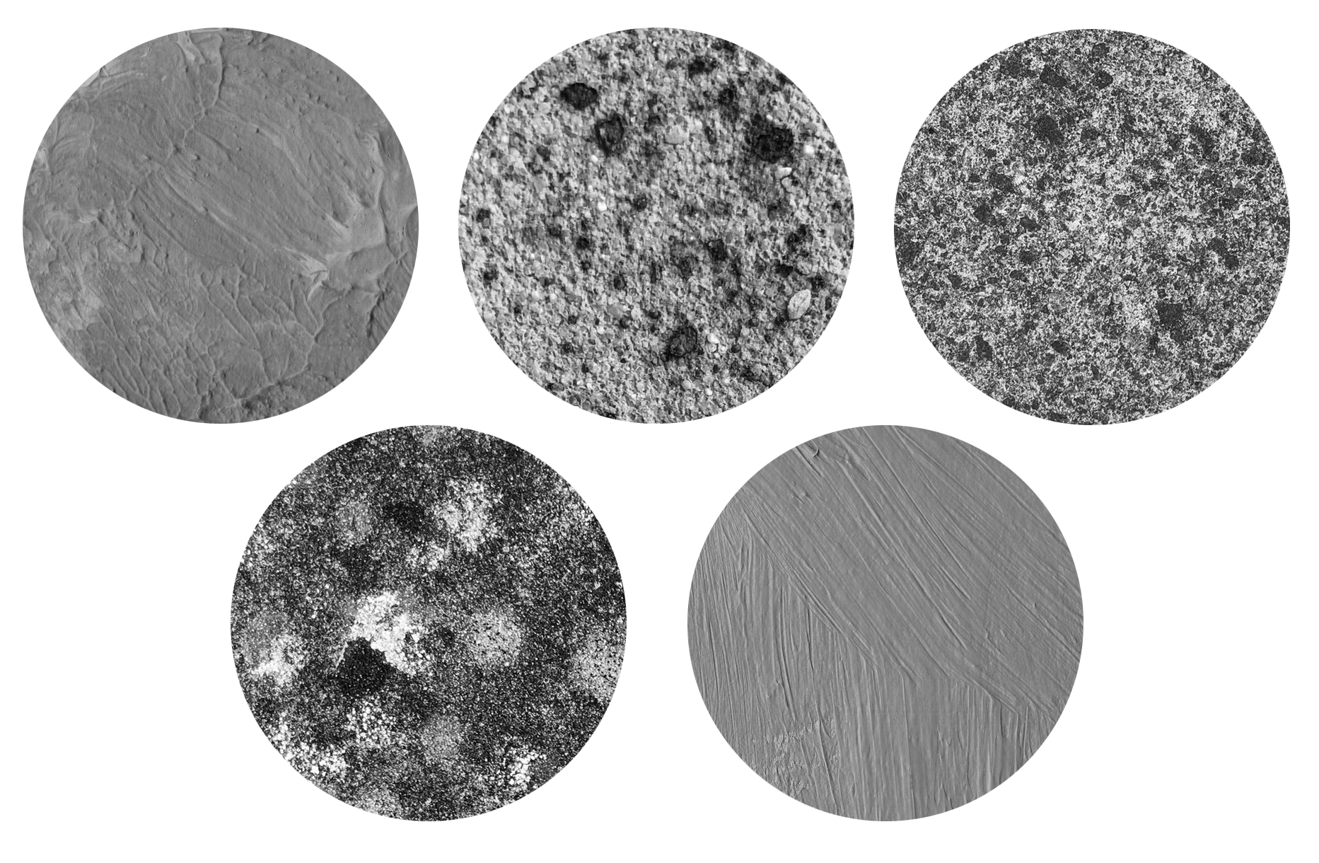
If you don’t use Photoshop much, there’s a few ways you can add a texture like this to an illustration, depending on the effect you want (Overlay, Multiply, Soft Light, Gradient Map, Opacity levels etc.), but in non-Photoshop terms, in it’s most simplest terms, it’s kind of like you’re making it a transparent layer that you’re placing on top of (or under) another layer. (Imagine it like the coloured cellophane on a Quality Street chocolate.) This meant I could add more textures and and colours, but retain some of the quality of the paint/stone.
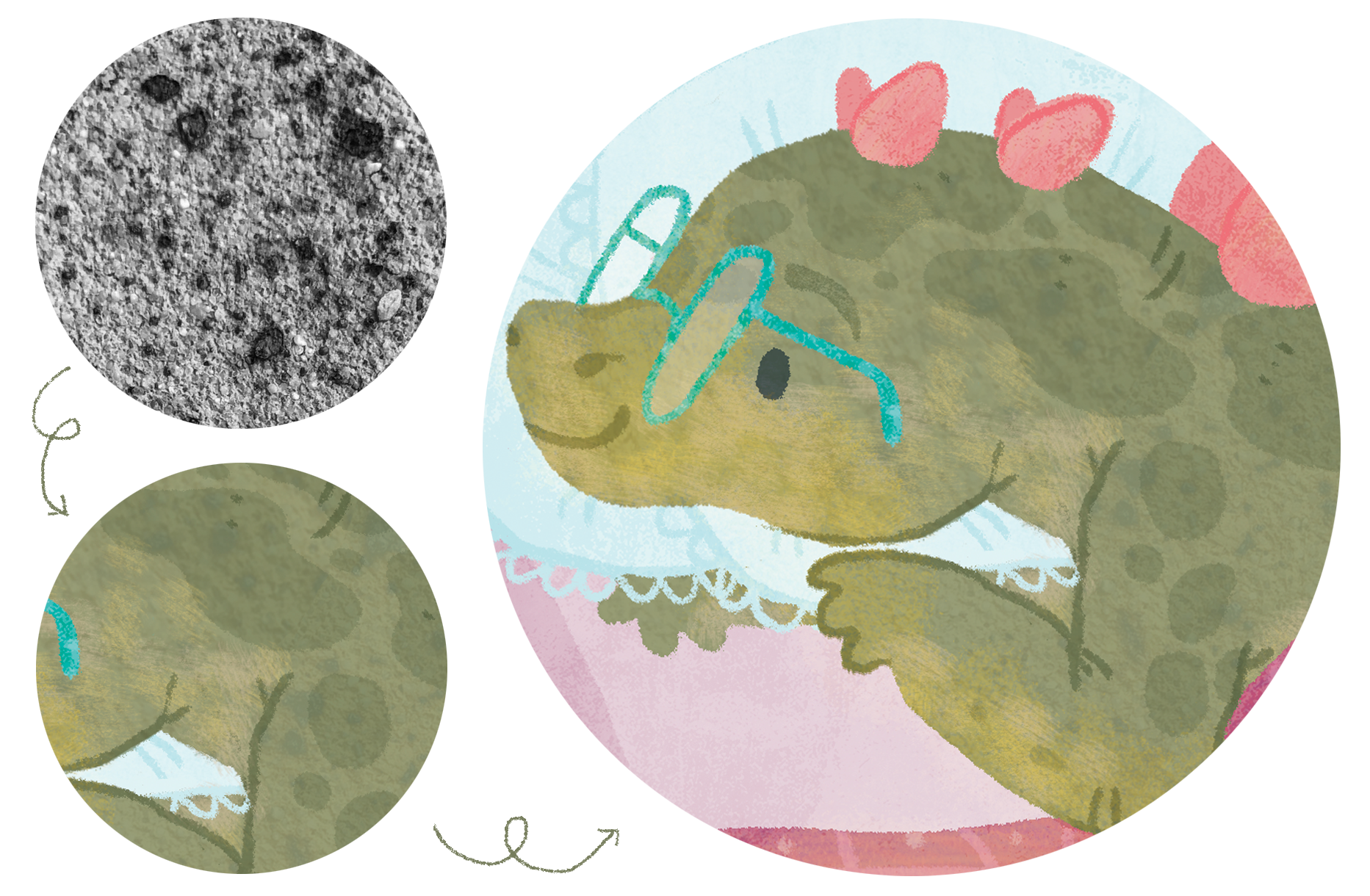
As for the design of the actual characters: as I said before, I don’t like referencing other illustrations when I’m illustrating, and try to only stick to real life or photographs - which is a little tricky when drawing prehistoric animals.
I stuck to using ‘realistic’ drawings or models of dinosaurs as my reference point, but so many of them were of adult dinosaurs - and a tiny percentage of them were sleeping/lying down/basically doing anything except standing or roaring, so I also used other animals with similar body shapes as references too (e.g. armadillos, crocodiles, elephants).
I had some fiddling around with their shapes to make them childlike and cute - like making their heads larger and legs shorter, and this is how they ended up!


What do you think? Next month, I’ll show you some more illustrations and talk a bit more about working on the book!

I’m running an illustration retreat focussing on picture books in Rome this year - find out more here!
And, pre-order my new book Nighty Night, Dinos here!

✱ I had a lovely few days back in the UK in May, where I saw sooo many lovely friends, went to the Cambridge Beer Festival, and visited the Wes Anderson exhibition in London (I loved seeing the Fantastic Mr Fox models).
✱ The weather! Has been so sunny! And hot! I feel like I’m on holiday every day.
✺ We have so many guests visiting over the next couple of months (or literally here right now!) so I’m excited to see them all, and find new Swiss places to explore with them!
Ok, that’s all from me. Have a sunny day!
Hugs, Anna x
I love this look into your process, Anna! Your art truly makes the book shine!